#typesetting template
Explore tagged Tumblr posts
Visit Tumblr Blog
Explore Tumblr blogs with no restrictions, modern design and the best experience.
Last Seen Tumblr Blogs


Fun Fact
Average visit duration of Tumblr.com is 10 mins and 25 secs.
Text
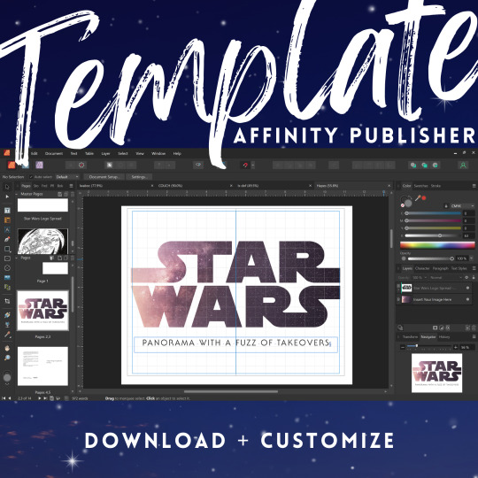
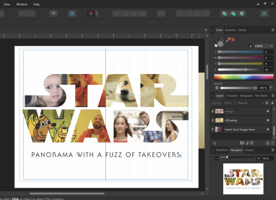
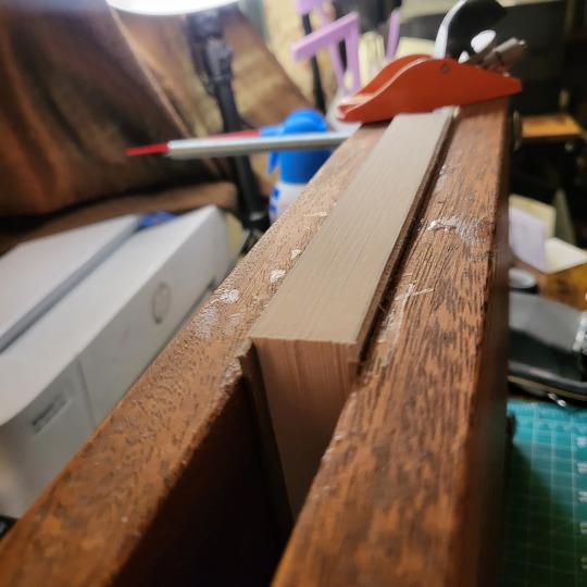
Star Wars Fanfic Template for Affinity Publisher
Affinity Publisher really intimidated me until @mourningmountainsbindery shared a sample typeset template for me to try out. It helped so much. I’m paying it forward, by sharing my own templates for Star Wars binding.
If you’ve been hesitant to learn Affinity Publisher, I hope this template helps you dive on in. This typeset template is perfect for fans of Reylo, Kylux, Stormpilot and other Star Wars sequel trilogy fanfic.
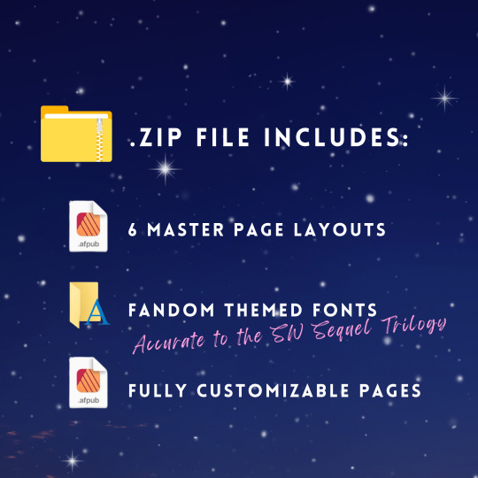
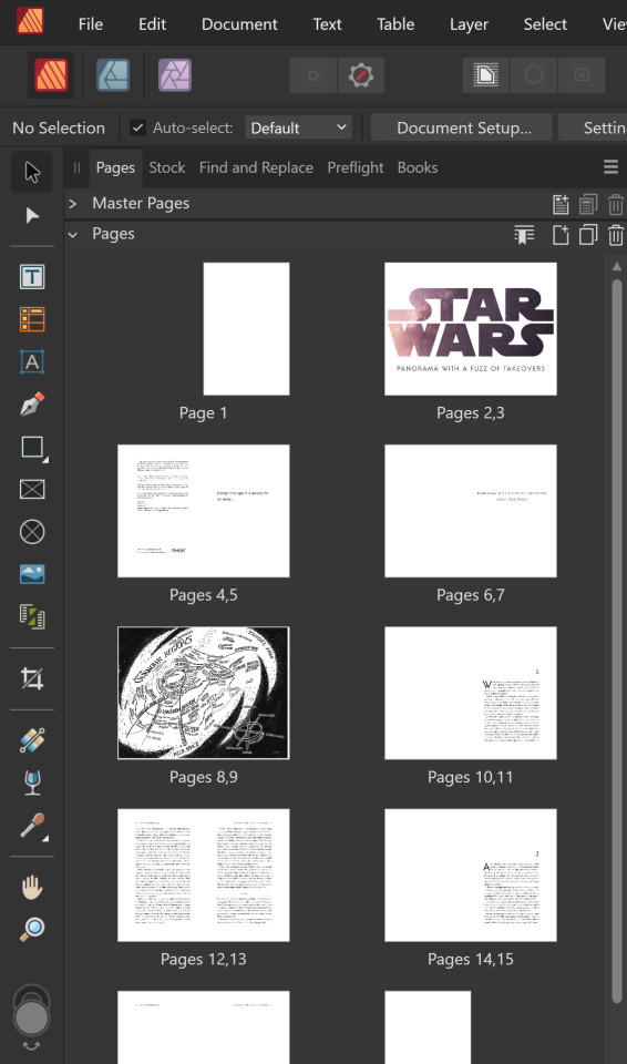
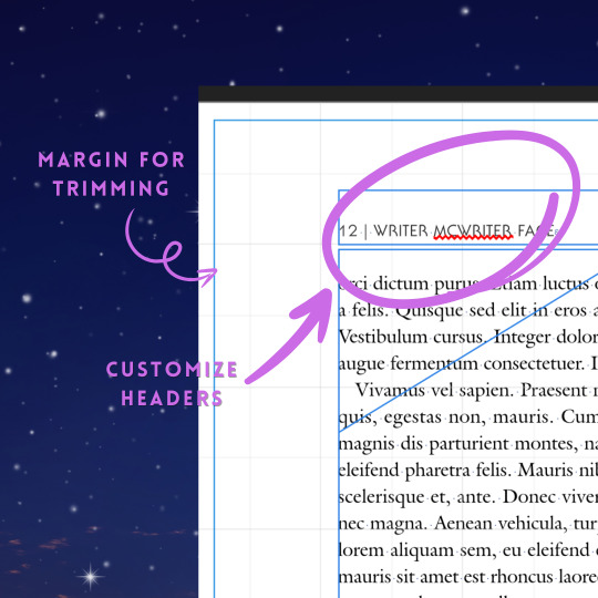
My favorite part of this template is the Star Wars title page, which you can customize with whatever images you want to fit your fic!
This template is intended for personal, not-for-profit, transformative use ONLY.
It has been made available at no cost to the fanbinding community to help make home bookbinding more accessible for everyone.
Affinity Publisher is owned by Serif Europe. Star Wars is owned by a company that has decided to cater to alt-right dudebros. The licenses for the fonts are owned by their respective publishers.
If you’d like to support my work, please consider keeping the attribution, share widely, and do not monetize what has been made freely available. Also, check out my online shop for fanfic bookbinding supplies!
Thank you and happy fanfic binding!
Visit my LinkTree to grab the template!
#fanbinding#fanfic binding#fanfic bookbinding#affinity pu#typesetting template#typesetting#ficbinding#star wars fanfic
26 notes
·
View notes
Text
Typesetting is one of those things where it's fun when it works and it's hell when you can't figure out the single setting that would make everything work properly
#i have a template i made the first time so typesetting isn't too hard#but i had to figure out one of the settings i didn't have saved and i was just clicking things until i finally opened up a previous project#and reverse engineered what i'd done from there lol#bookbinding#sedumlineare
1 note
·
View note
Text
How obsessed and hyper-fixated are you with your fanfic characters?
Me:
BOOKBINDING!
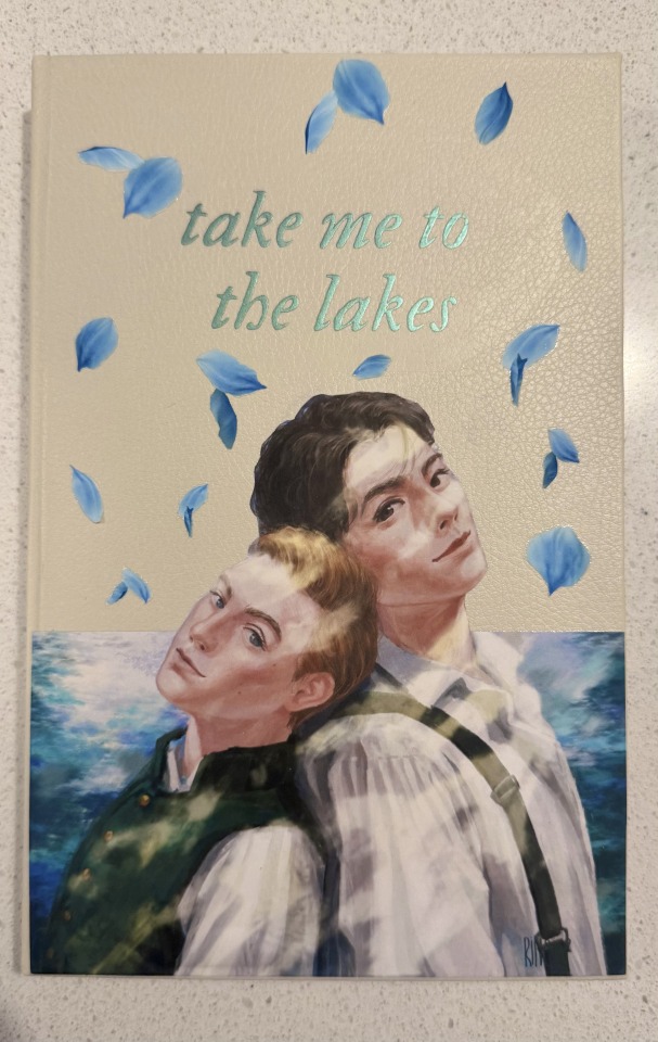
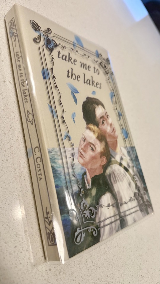
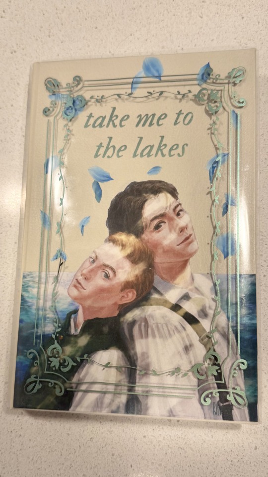
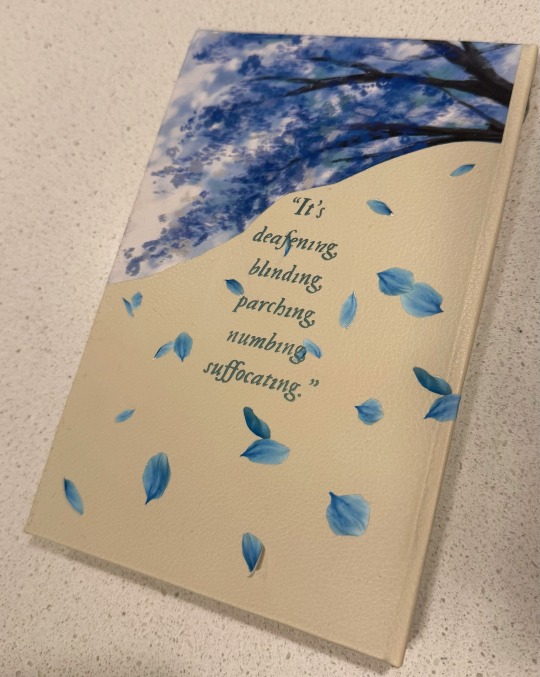
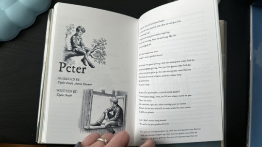
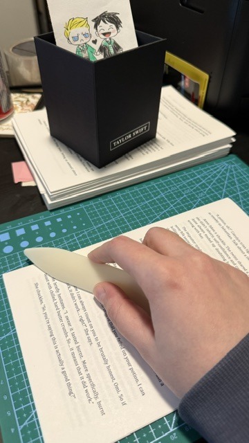
Ominis and Phineas now sit on my shelf along with my other books ♡
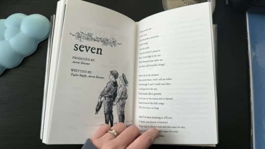
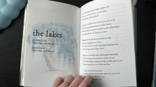
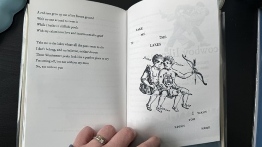
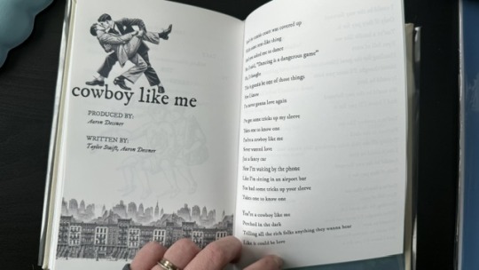
This was my first time binding fanfic, and no better choice than my own, "Take Me To The Lakes" (AO3 / Wattpad)
update (March 30): New cover art by the amazing @rinthecap 🩵
More photos and the step-by-step after the cut! (+ the appendix with Taylor Swift songs in a stylised lyric book)
I'm all about my crafty hobbies. I've been eyeing bookbinding for a while, and the algorithm finally convinced me to dive into it so I'd have a reason to procrastinate on writing
Having written a shorter fic ("Lakes" is roughly 35k words) gave me the perfect opportunity to start with something simpler.
The main tutorial used is the one by NeatFreakGeek on Tiktok.
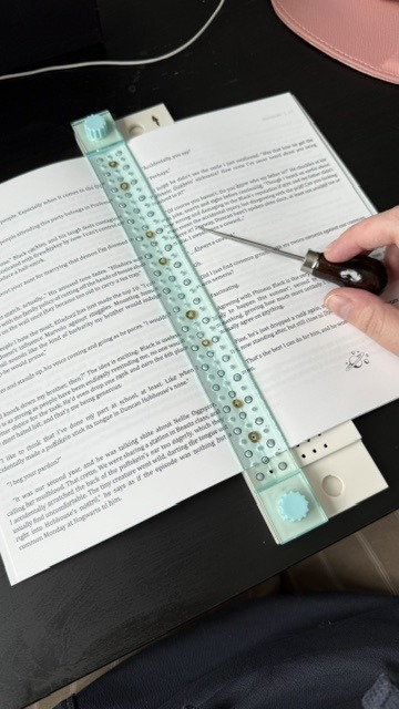
Step 1: The typeset
I used the base template file by NeatFreakGeek, which already had the settings for printing in formatted book signatures.
With the basic body of the document formatted and ready, I started the personalization: choosing the fonts, spacing, sizing etc.
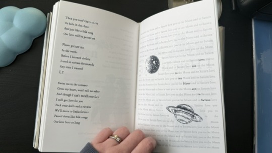
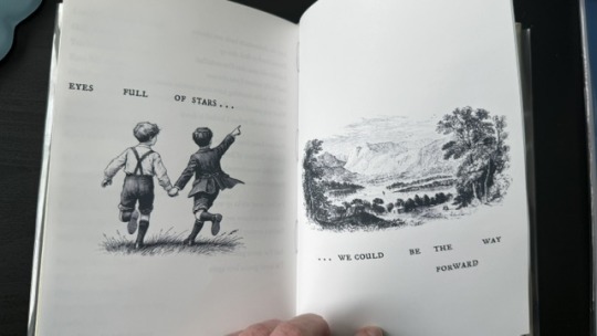
For the quote at the beginning, I chose one of the lines I wrote for Ominis + the wisteria.
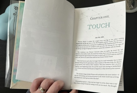
For chapter headers, I chose the Gemini constellation. (In the story, Ominis and Phineas got their middle names from the stars in the same constellation, Castor and Pollux.)
I also made the chapter titles with the HTV to give it an extra glow.
Sight is overrated. Phineas makes all my senses the very essence of life itself.
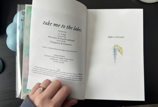
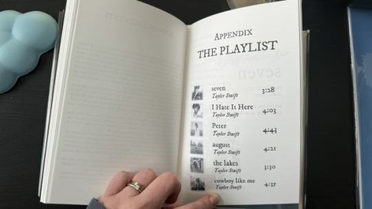
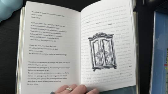
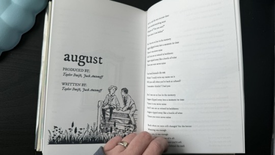
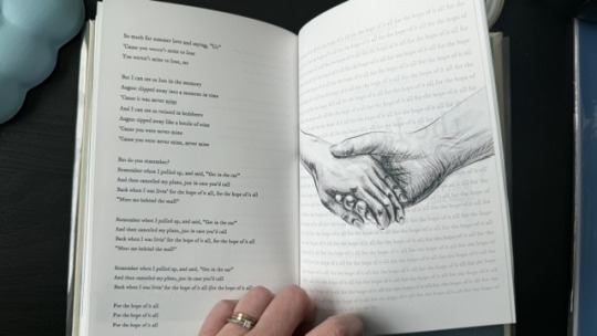
Since the story was rather "short", in order to have a thicker spine, I added an appendix with the stylised "lyric book". This was probably my favourite part of typesetting!
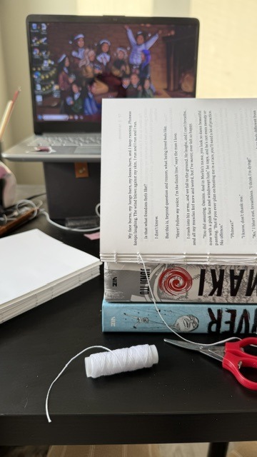
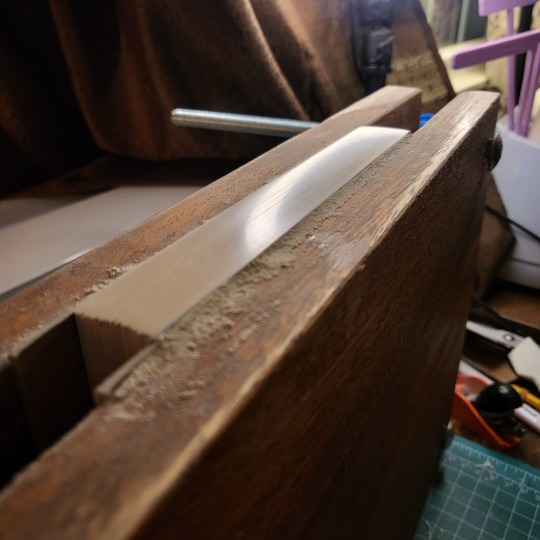
Step 2: The textblock
With a little lot of trial and error and more mathematics than expected, I printed each signature at a time, then folded each at a time, making sure it didn't get mixed up across the signatures. My printer does front/back automatically, but to print the commissioned arts as borderless, I gave myself a headache, printing it separately and manually. This step could have been done considerably faster with a laser printer and b&w content only :)
Next, it was sewing and glueing. I won't go into detail here because the video tutorials are way better at explaining. All in all, with the right tools, this was done rather easily and with barely any mistakes, so I didn't have to print anything again, thankfully.
Step 3: The endpapers
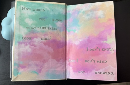
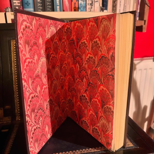
I got a scrapbook 12x12in block in this abstract colours. I had many different ideas on how to match the theme, but I ended up choosing these colourful patterns that align with how Ominis perceives the world. Then, I added the quotes from the story.
The endpaper of the front got this sky-like print to go with the dialogue Ominis and Phineas have when they are children.
P: How would you know what blue skies look like? O: I don't know. And I don't mind not knowing.
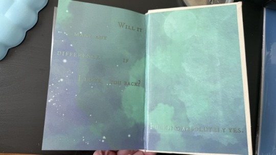
The endpaper of the back is in green x blue shades, colours that are also a big part of the story. For the quote, I chose one of their last lines when their relationship is established.
P: Ominis, you always care too much about the others... but who takes care of you? O: No one ever did. P: Let me care for you. Please. Let me love you, Ominis Gaunt. O: Will it make any difference if I say no? P: Absolutely not. O: Will it make any difference if I love you back? P: Fucking absolutely yes.
Step 4: The cover! (Yes, the most interesting part!)
This was the most challenging step in both the conception of the design (too many ideas to choose from) and the execution (I've never hated box cutters so much.)
With the basic cardboard casing cut and glued, I chose a faux leather material as a book cloth. This might be the choice I regret the most, because the glue it comes with is not that strong, so it would often unstick easily, and also, it's a bit too thick, leaving the corners a bit weird. But the final result was a bit worth it.
For the cover design, I printed the art with fabric HTV and ironed it on. On top of it, I threw in some wisteria petals (a reference to the song "the lakes", by Taylor Swift), and another quote of the story at the back.
I didn't have a cricut machine back then for the vynil pieces, so I ordered it online. This part was harder than I thought, once again because of the faux leather choice: as I ironed the HTV, some parts of the material melted lol.
Lastly, I decided last minute to create a clear dust jacket because the combination of the faux leather + printed HTV seemed tro fragile to be handled. I liked the final result, but ironing the HTV on the acetate was a pain lol.
In summary, this was so much fun and not as hard as I expected, craft-wise. The designing of it all took the most time just because I wanted every little detail to have a meaning :)
I made two copies to gift one to a friend, so it gave me the opportunity to make the first one and mess it up, then, for the second one, I had already learned from my mistakes.
There are many things I'd do differently for my next binds, but that's the most fun part: experimenting with materials, themes, and processes.
#I have a lot of free time#In crafts we trust#now I'm even more motivated to finish my other fics just so I can print them#my family asked for a copy now I don't know how to explain that I won't let them read my fic in a million years#hogwarts legacy#ominis gaunt#ominis gaunt fanfic#ominis x mmc#book binding#bookbinding#fanfic binding#gay fanfiction#gay#lgbtqia
59 notes
·
View notes
Text


I'm posting this so much later than I meant to, cause my new addiction to crocheting has stolen all my free time and brain cells, been sitting on this for almost two months 😂
I did my first author copy! Its actually super cool because their work "The Long Hangover" by @coffiocake was actually the first full bind I ever did, so its like I've come full circle!
I've re-read this work at least five times at this point, I love it so much! Thanks @coffiocake for your amazing work, and I hope I did it justice 💕
Since this was my first bind and my most recent bind I thought it would be cool way to showcase how much I have improved since I started bookbinding.
I have definitely gotten better at cover design. I learned how to upload new fonts into Canva for starters, which has made a huge difference. I really think the font makes the cover, and in the new design on the right, the font is literally called "Watchtower" 😆. In the original design, I was mainly just going for general gothic vibes. I still really like the original design, but I think the new one matches the work much better.
Aparently I've gotten worse at ironing on vinyl lol. Still haven't figured out the right temp, pressure, and time for this specific vinyl.

I think the most noticeable improvement has been in my construction of the text block. Since I started, I've picked up a lot of little techniques, to reduce swell, fold the pages evenly, and keep the signatures in line when sewing it together. I have also gotten nicer paper that is slightly thicker, the proper grain, and a softer color, while the first one was on regular printer paper.


My typesetting skills have greatly improved. I had soooooo many mistakes in the original 😂 the headers were on the wrong side of the page and I somehow didn't notice till I was folding the pages, my drop caps look a bit weird, and the chapter headers are too large and far down the page. The biggest thing is that the margins are off, another thing I didn't notice till I was folding. That part was actually an issue with how I was printing, and not with the actual typeset.

Now, I prefer to have my page numbers at the bottom instead of in the top header. I keep the top header centered, and I learned how to remove it on chapter header pages. I'm much better at inserting the drop caps and designing chapter headers. I think he new version looks much cleaner.
Something I only recently started doing, was including a copyright page; I find it adds a lot to how legitimate the book looks. It has all the work information, as well as the classic fanfic unaffiliation statement 😂
Something cool that I saw someone else do recently was include a QR code to the work on this page. I'll have to re-work my template, but I loved that Idea and am going to try and incorporate it on future binds.


#bookbinding#typesetting#ao3#fanfiction#archive of our own#fanfic#book cover#batman#superman#fanbinding#superbat#clark kent x bruce wayne#justice league#art progress#long post
38 notes
·
View notes
Text
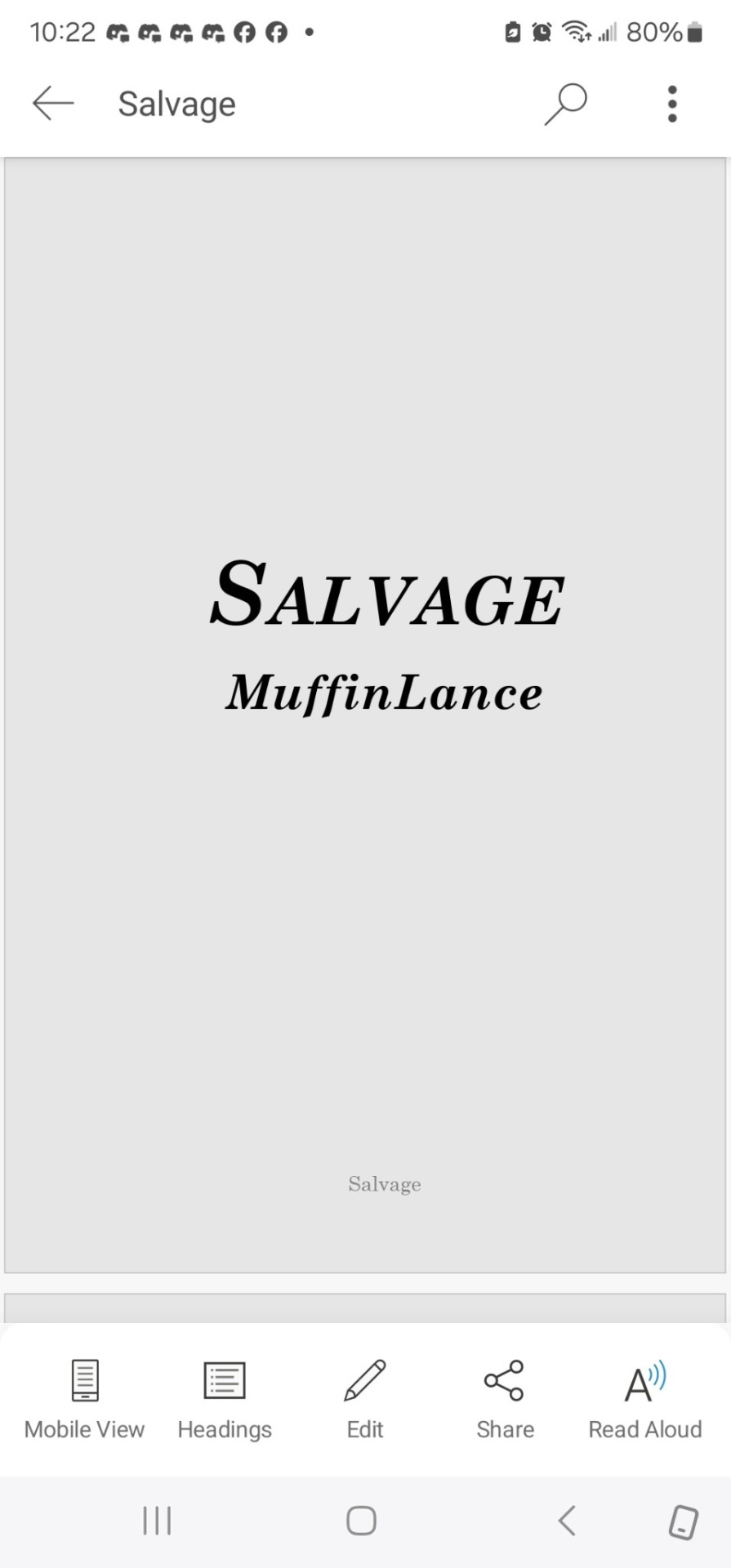
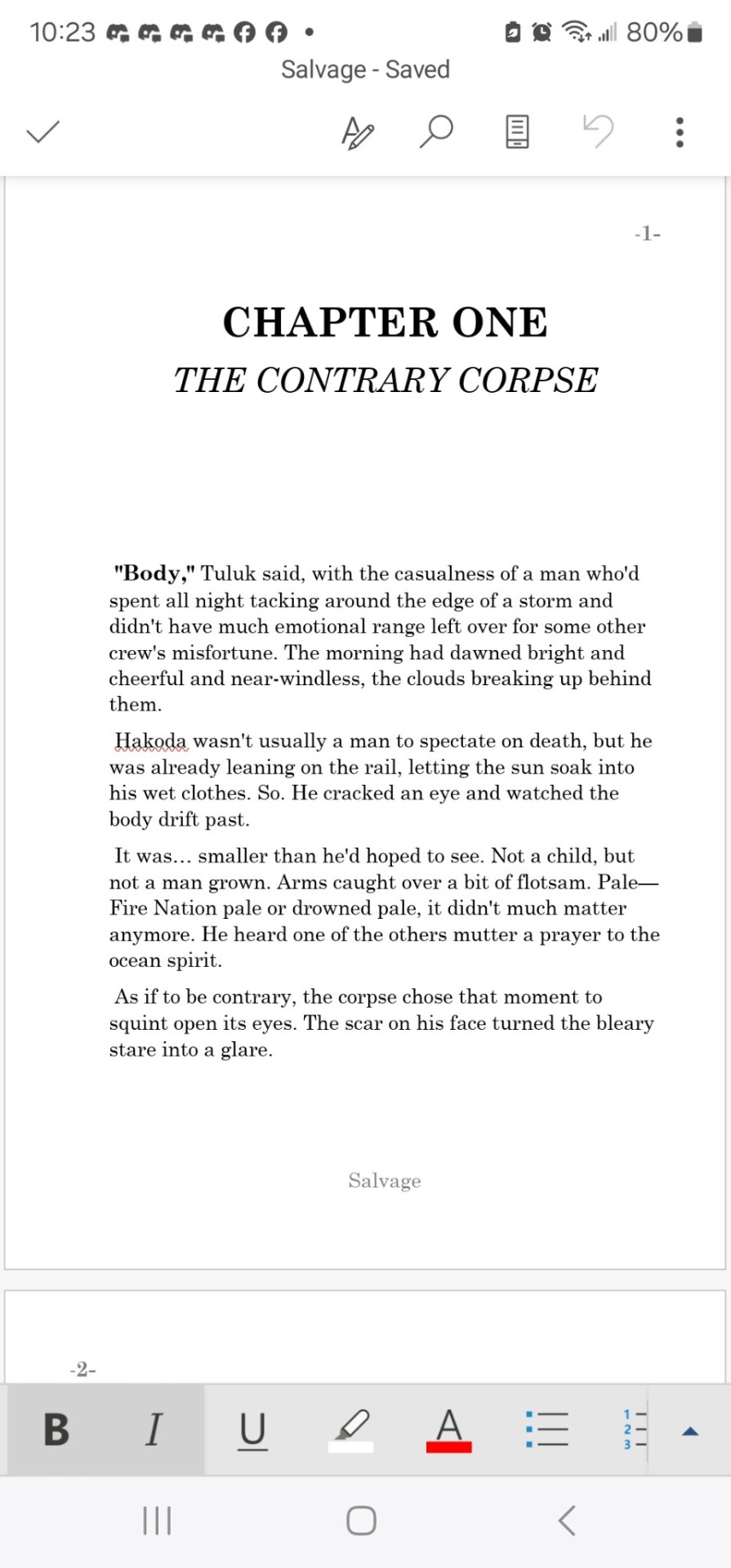
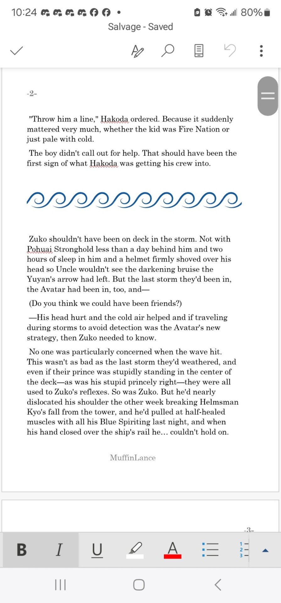
So... @muffinlance wrote a really awesome story. I read a post from a point in time, though I truly do not remember when since it seems like I've been working on this project forever, saying that she gives blanket permission for people to print and bind the story into a book (I think there was an also addendum saying that they do not give permission to be sold, since selling fic is illegal). This fic has had total control over my whole brain since it was sent to me (@creatorofthemind I believe it was you, so thank you forever for tuning me into it) back during the days of like chapter six or seven.
So here I am now, sharing this amazing journey of my first ever bookbinding adventure. Further reading below.
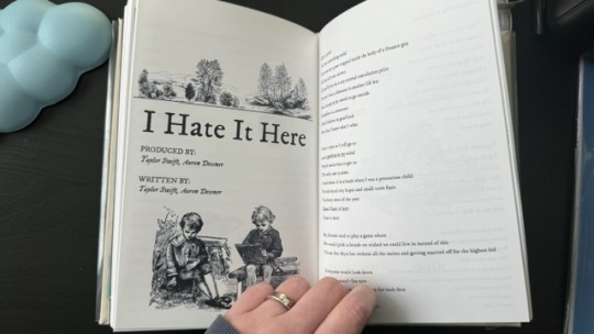
So to give you an idea of what's going on, this is a fanfiction about Zuko (Avatar the Last Airbender) (animated show version, the LA show did not exist yet and we do not speak of the movie) being adopted by Hakoda, Father of Katara and Zuko. (This might have also been what kicked off the Give Zuko A Parent craze, but don't fact check me.)
Overall, the characters from the show stick very well to the cannon versions, but where MuffinLance really shines is in the rich backstories and fleshed out feeling of all the non cannon elements. Especially the background characters. I would argue that the writing in this peice of fanwork could easily rival the cannon show at many points of comparison.
Now that you have context, we can get into the actual process.
To start, I used this guide to figure out where to even begin, and fount the included resource list to also be quite helpful. I cannot for the LIFE OF ME figure out where I found the template I used for the front matter and such, but it must be somewhere and I will link to it when I inevitably come across it again.
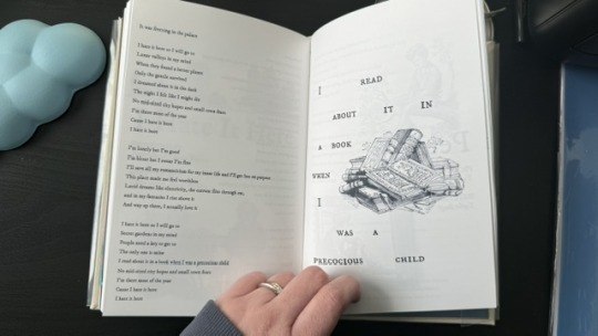
Then I began to typeset. This step took... a long time. I worked in chunks from about September of 2022 to late March of 2024. I would get a big section done, sometimes even the entire thing, but then find I hated the way I had done it and give up for months at a time. Such is the life of ADHD and flitting interest in projects I suppose.
And then finally, step one was done, and I was left with pages on a word document that look like this. (And do please let me know if you want the link to the document. It was so much work, and I would love to not be the only one to use it.)
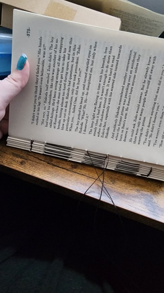
Next step was printing out this beast. Ended up being about eight pages of front matter, and about 630 pages of body text.
That I printed wrong.
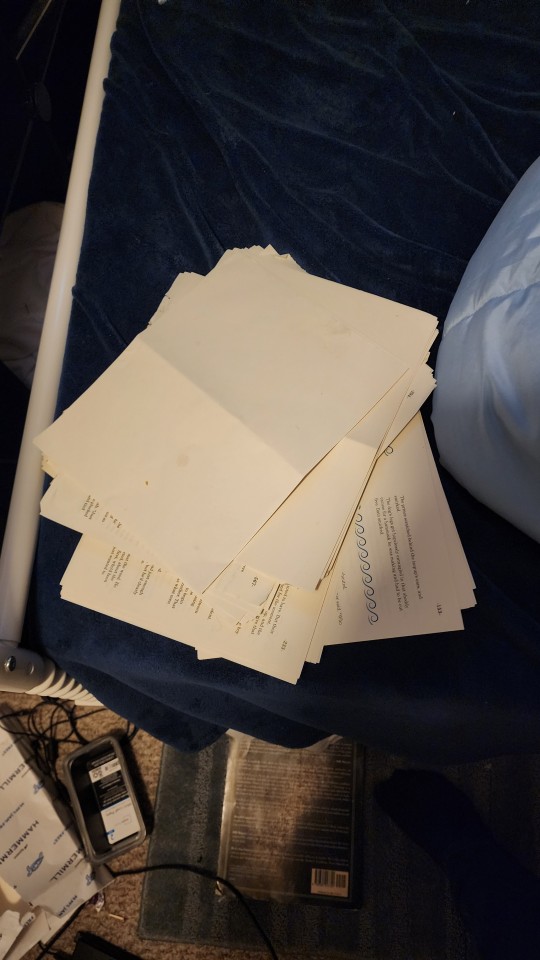
Twice.
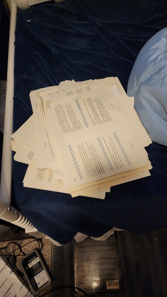
Before finally getting it right. And then not getting a picture of it, because I finished at 4 am and had work at 7, and am also an idiot.
Then I simply stitched along, putting everything together into a beautiful text block.
And came up with a design for the cover.
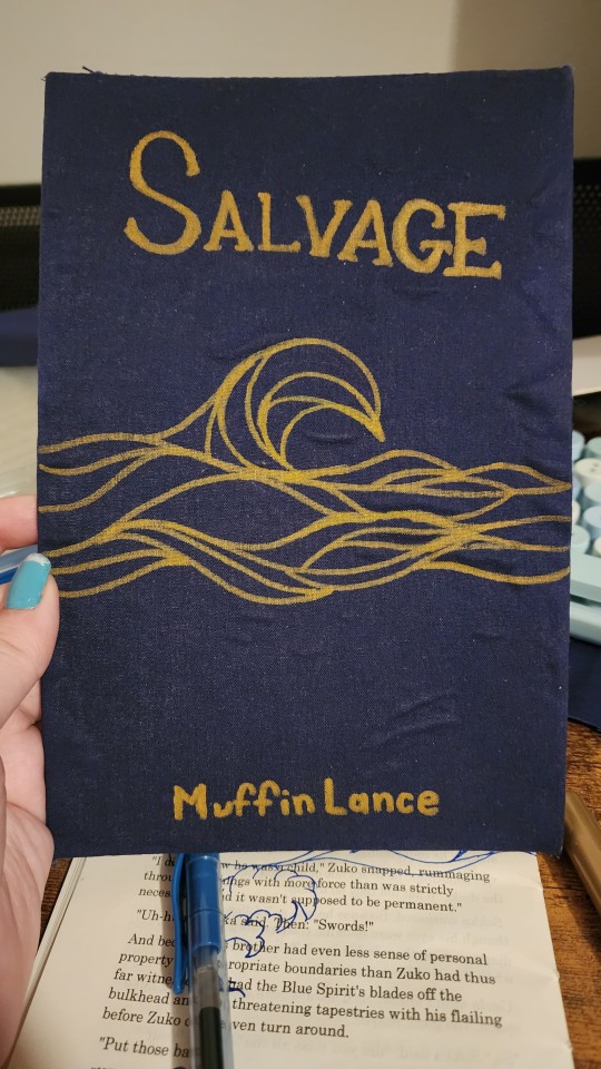
Yes the glue did end up lumpy. Ignore it.
Yes I did have to sketch out the design onto a scraped page several times before I figured out what I was doing. Ignore that too.
The cover design does wrap around the entire cover. No I did not get a picture before I glued the thing down. See again: I'm an idiot. And just... massively impatient.
Finally, we get to the stage of gluing. Behold, my bookpress.
Of course, topped with Madam MuffinLances own actual professional-people book, Fox's Tounge and Kirin's Bone. It is Excelent. Here is the LINK so you can go and support this amazing author with the real-monies as well as the internet-kudos.
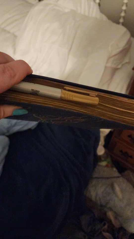
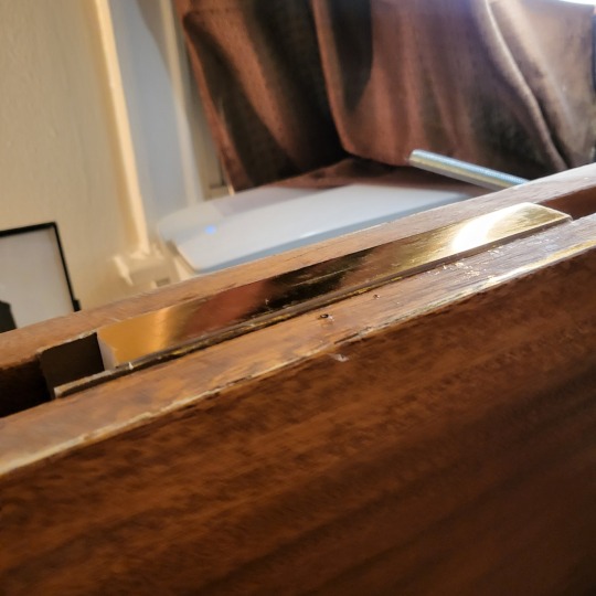
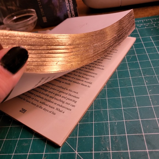
Then, once everything is glued together, one must give the book its "gilt" edges.
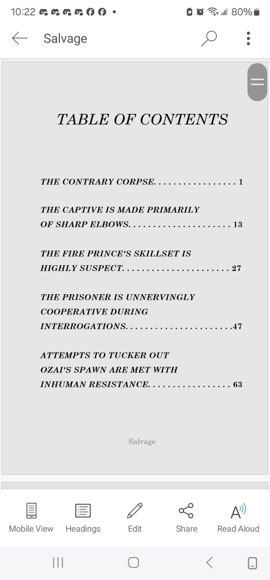
#atla#salvage#bookbinding#fanbinding#muffinlance#I'm a really big fan of this story and the characters ok?#They're really fun and I love them.
154 notes
·
View notes
Text
I've been book binding for about 4 years as a hobby, but I've mostly just bound my own sketchbooks.
Since I go back into reading this year I've been converting some of my paperbacks to hardcover and it just feels like a completely different process. However, I then decided, "hey! I have lots of friends who read fanfiction and online not-published works, I should ask them if they want anything bound!"
Long story short, I spent a whole day creating a "professional level" typeset template in word. It's so amusing to me how in school I barely wanted to do anything and now as an adult I'm like "Oh yeah I'll spent six hours formatting a document."
370 notes
·
View notes
Text
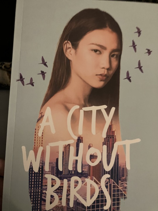
"Dawn Again, on this Vibrant and Violent Night" Saiouma Paperback Book Giveaway is open!

Entry Form: https://forms.gle/gfcHac8HmZFFUkma7
Timing: March 1 - March 10, 2025, 11:59am ET
Eligibility: United States entry only
Link to Rules and Book Details
Reposts would be appreciated!! Some more details under the cut.
Why I started this project:
Reading a physical, printed book is a very special experience. When I was younger, I printed out stories from ff.net, 3-hole punched them and clipped them into a binder, bringing them with me everywhere. Last year, I commissioned a hand-bound print of this story just for me. Now, I want to share that experience and joy and love with you, for readers who have already experienced this story, or for someone wanting to give it a try for the first time.
Even though I finished writing this 3 years ago, I feel like me printing and sharing this is something that I can do today to make a small difference, and hopefully make someone’s day if they need an escape and want a slow burn x murder mystery story.
Why I am only shipping to the US at this time:
My goal of this project has always been to get this book into your hands for free or as little cost to you as possible. I have never shipped anything “at scale" before, and as such, I want to ensure there are no issues, while fully covering the costs and following procedures within the US, where I better understand the shipping processes.
I would 100% love to figure out how to get the book into the hands of readers outside the US for a low cost, and to more readers within the US. I will continue to research this, and I ask for your patience.
What tools and services I used to create this:
I did the formatting and typesetting in the Overleaf LaTeX editor using a novel template that I then modified for margins and typesetting. I designed the cover in Clip Studio Paint, and used Mixam to print this as a zine. I’m more than happy to share my typesetting project files with other writers who are curious about my process!
Other questions? Please let me know! Thank you for your interest and support!
32 notes
·
View notes
Text
AYYYYYYYYYY
that makes me so happy :DDDD
I hope you enjoy it!!
(and yeah percy jackson is pretty good too)
@junypr-camus hihihi we don’t really talk much- BUT GUESS WHAT
I have it. In my hands. I’m so excited to read it (my newfound Percy Jackson obsession may keep hold of me until I finish it) but I am reading it the first chance I get!!!
#also did not know merriweather got so much love lol#man I just picked a typesetting template off a reedsy#please please rant to me about it as you read#Id love to hear your thoughts!!
11 notes
·
View notes
Text
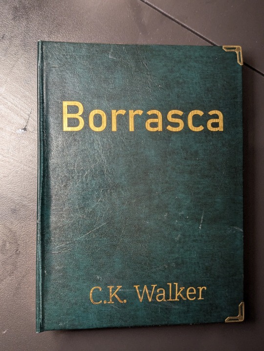
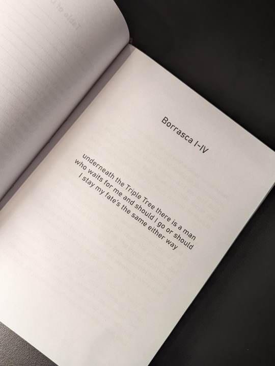
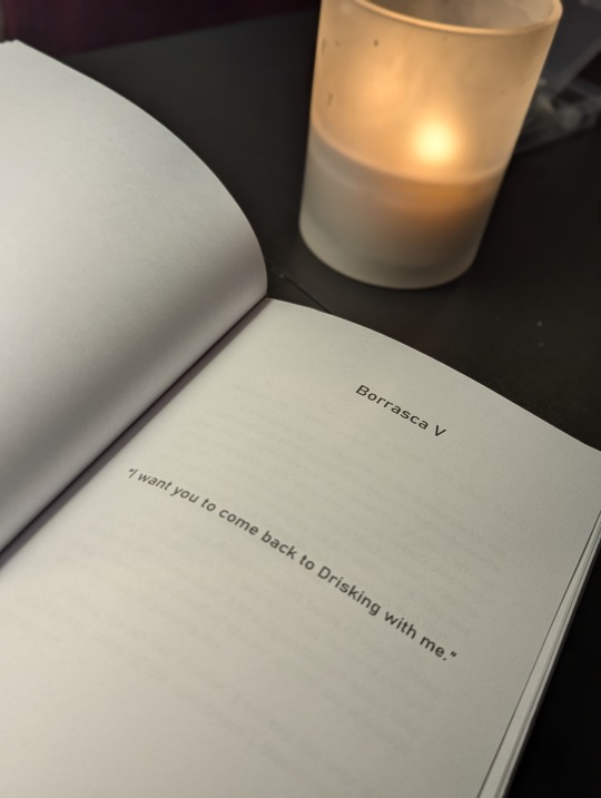
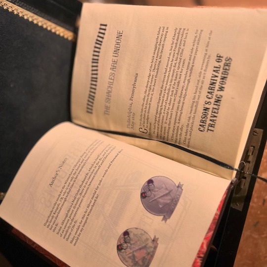
Borrasca - C.K. Walker
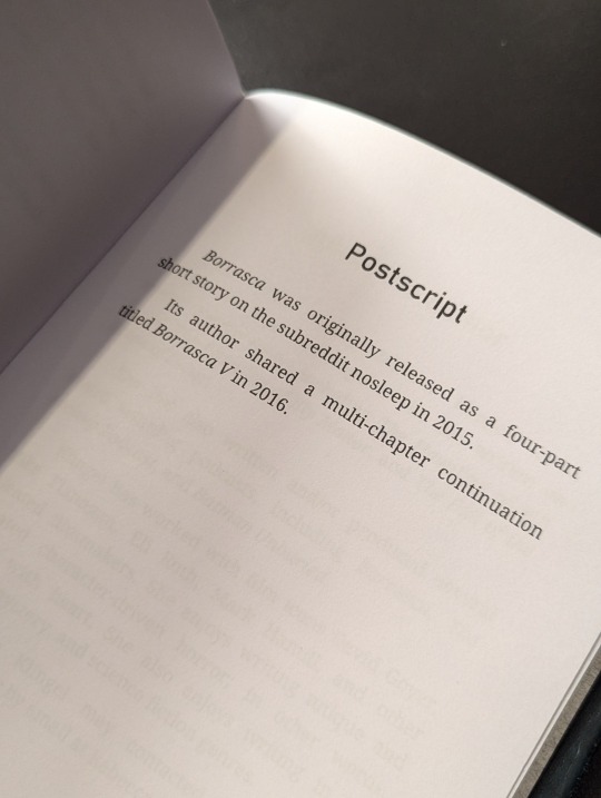
This is a /r/nosleep story published in four parts in 2015, with a subsequent fifth part shared by the author on their blog.
Morbid choice for a first bind—it's not dissimilar to Manacled in terms of dark content—but as a tale I read back in my creepypasta phase and recently rediscovered, I thought it'd be fun to have a physical copy for my shelf.
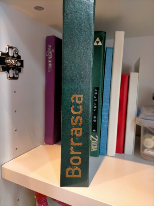
The case is bound in green bonded leather, courtesy of an amazing local store that has a plethora of bookbinding supplies. Gold adhesive backed vinyl for the cover text, while the corner-guards are from a random Amazon seller.
The text block is bog standard A4 printer paper. Body text is in Noto Serif 12pt with titles/headings/pagecount in Bahnschrift. 59,000 words and 387 pages total.
Reflections on mistakes and lessons learned under the cut with more pictures.
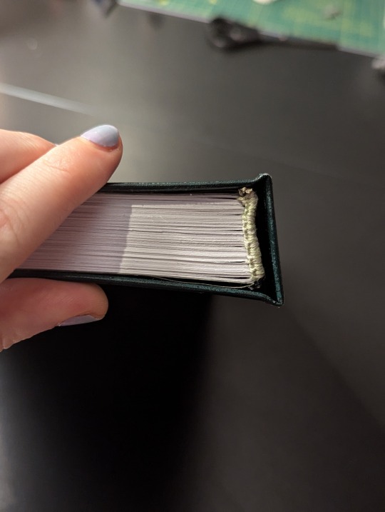
I learned a LOT about typesetting, booklet printing and using a Cricut in making this. I still made a few silly mistakes with my next projects, but not so many as I did with Borrasca.
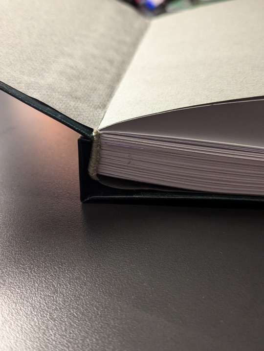
It's a rookie's first bind and it shows—the text block fits rather badly in the casebinding, because I goofed and made the spine support too wide. This doesn't look too bad from the front or the spine, but in opening the book the textblock shifts rather awkwardly.
I also scuffed the leather in parts, and totally misstuck the title on the spine. This is before I realised what transfer tape was for 🫠 Having the title running from bottom to top is novel, but I didn't want to risk gumming up the cover further by fixing it (not to mention my horror at the thought of repositioning everything by hand).
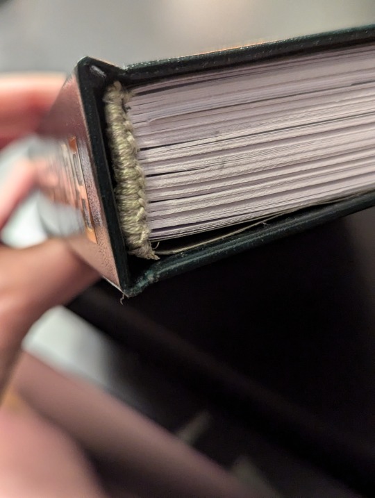
I'm pretty happy with the handsewn headbands though! I followed chezlin's tutorial and used tissue paper to secure the twine to the spine before sewing on embroidery thread. While the thread used was a little too thick, the headbands add a nice touch.
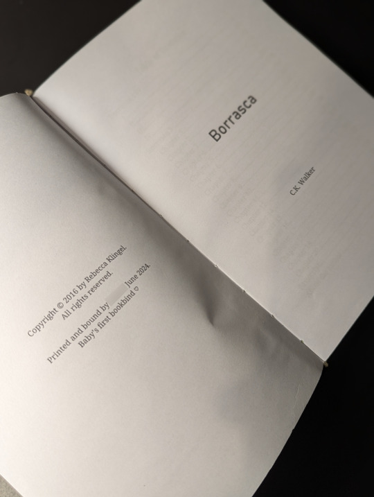
I had no idea what to put in the copyright page, ahaha. I've put a template together now, which does a better job at identifying the resources used and linking to the source material.
68 notes
·
View notes
Text
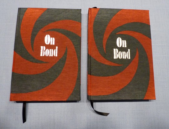
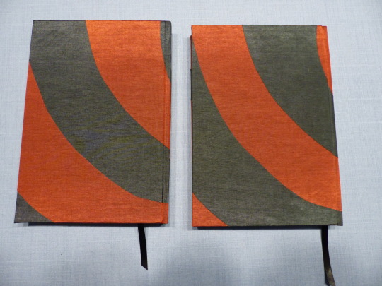
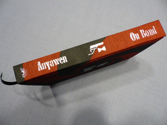
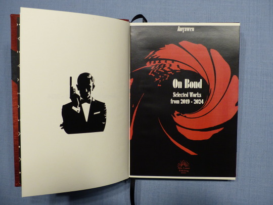
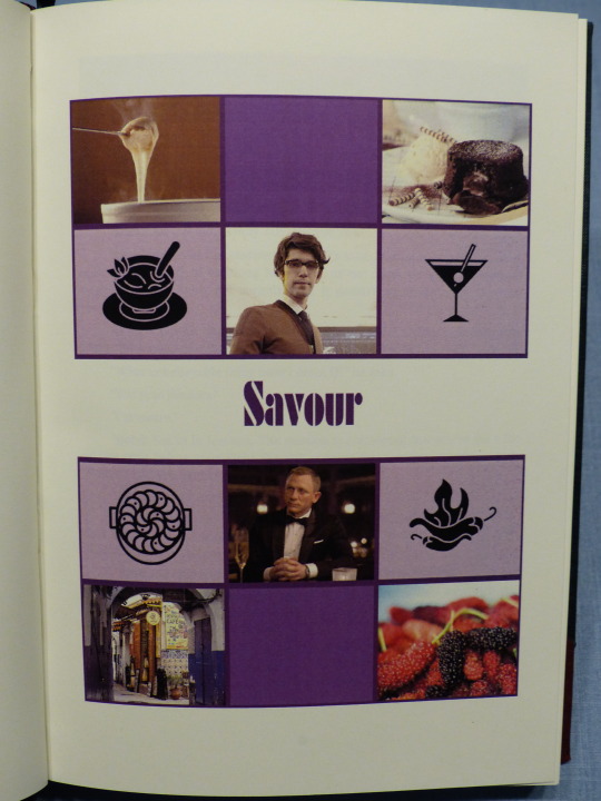
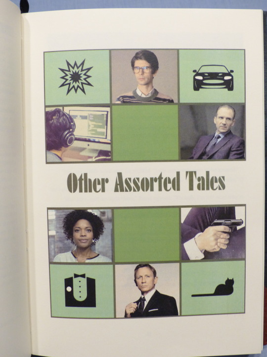
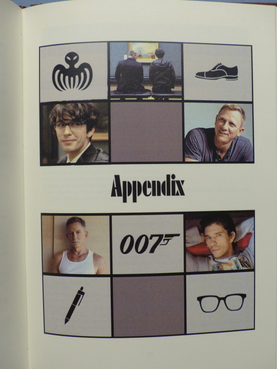
FTH Fanbinding: James Bond Short Story Collection by Anyawen
And here is my second book for this year's Fandom Trumps Hate event! @anyawen won my book raffle and wanted a collection of most of her James Bond short stories and drabbles. There are 82 fics in this book! 😅
Now that Anyawen's copy has finally arrived (after sitting for about a week at Frankfurt airport *sigh*), I can post about the book!
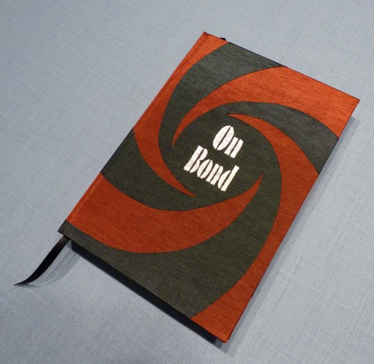
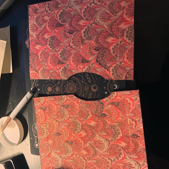
I used the gun barrel sequence as inspiration/template for the case design. Originally, I'd planned to make the two different linens fit together like a puzzle, buuut my cutting skills aren't that great and there would've been too many obvious gaps. 🙈 So I did two layers instead, which also doesn't take away much from the desired effect because the linen is quite thin.
The two copies I made are sisters, as I reversed the colours to save a bit of linen. I like the black circle a bit more, but am pleased with both copies.
The typesetting took, uhhh, a long time. 😆 Just harvesting all those fics took several hours, and arranging them to my liking even more so. Anyawen had sent me a list with the fics she wanted to see in the book with different sections mentioned (series, stand-alone drabbles etc.). I used those sections for the book and arranged the fics in chronological order; there are perhaps a handful of exceptions where I had to switch around fics because it would have messed up the formatting (two dangling lines on the next page etc.).
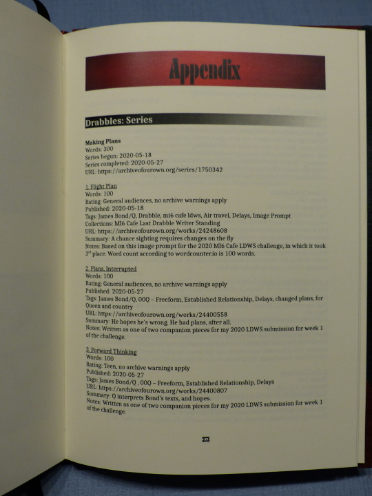
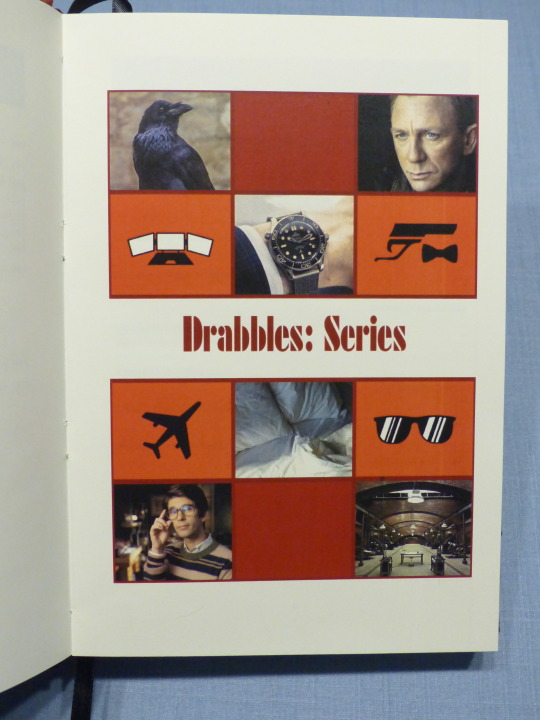
I made an extensive Appendix for all the fic stats.
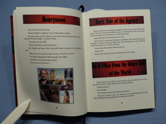
For the title page, I also used the gun barrel sequence as it's so iconic for the franchise. After I'd printed the book, I change the title page again because I didn't like how the first version came out in print. With this version, I'm very pleased though.
As Anyawen made several moodboards for her fics, I used that as inspiration for the section title pages. Making those was a lot of fun and I'm really pleased with how they came out.
Thank you again, Anyawen, for participating in my FTH offer and giving me your trust with your fics! <3
Materials used:
Printed on Clairefontaine DCP 100g
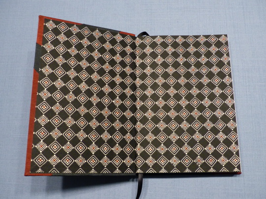
Case and endpapers:
booklinen Colibri graphite
booklinen Colibri cranberry
Japanese paper Katazome 70g
Hot Foil (Memory Keepers)
#fanbinding#bookbinding#arts and crafts#my fanbinding#james bond#books#fth#fth 2024#fandom trumps hate#fth crafts bazaar
45 notes
·
View notes
Text
Book No. 27
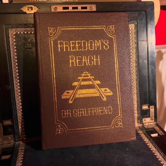
A charity bind for @dr-girlfriend, and coincidentally a fic I adore, which is a lovely bit of fortuitousness.
Finished on the 20th of October, according to my binding journal, but only reached the lovely Dr. G today! I was so delighted when she reached out and asked if I would consider binding a copy of this fic for her — it’s a longtime favourite of mine, and it was a fun work to typeset. I wanted to lean into the setting as far as I could without tipping over into outright cheesiness, and while I don’t know that I fully succeeded, it was fun to try.
The foiling on this was a pain, mostly because I wasn’t very clever how I went about it - the sheets of heat-transfer foil I was using weren’t big enough to cover the whole design, and I when I tried to use the cricut, it didn’t take where I used tape to cover the join in strips of foil. Stencil vinyl, my beloved for foiling, also didn’t work as the design was too big to place on the foil without buckling.
I ended up cutting templates out of sticker card and using those on top of the foil, and used a heated pen tool into the crevices of the stencil. It’s still not 100% but it’s better than previous attempts.
My favourite thing is probably the endpapers — the gold touches in them are really shimmery in person, if not in photos. I also used it to line the slipcase I made, which was a last-minute addition made when I was panicking that the cover was a little too floppy for this book. (The cover ended up firming up compin the press, and the case apparently got a little damaged in transport and is protecting nothing 😅, but I still think it’s a fun touch.)
28 notes
·
View notes
Text
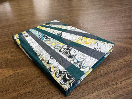
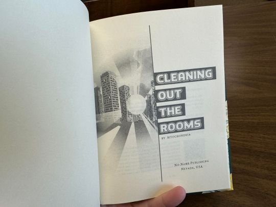
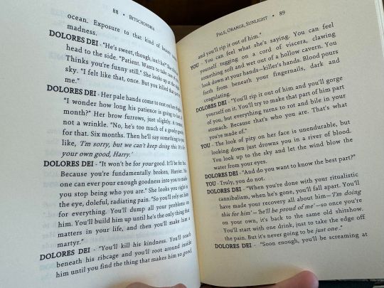
Cleaning Out the Rooms by bitochondria
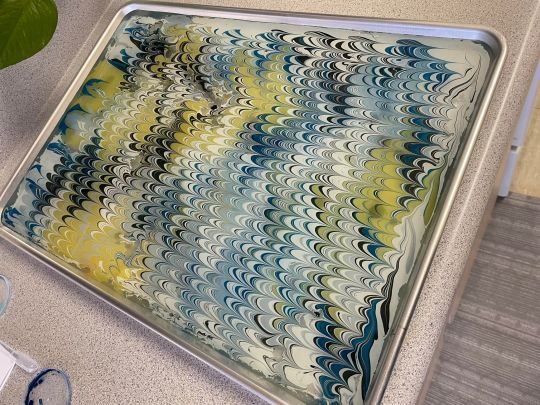
After all this time I'm finally calling this bind complete. The concept was a radial pattern with intersecting shapes of desaturated materials in the same tone. I think it was mostly successful, but it was time to move on to other things and stop fucking around with this lol. If you like Disco Elysium and Harry/Kim consider giving this fic a read if you haven't yet. More pictures of the final result and progress pics under the cut.
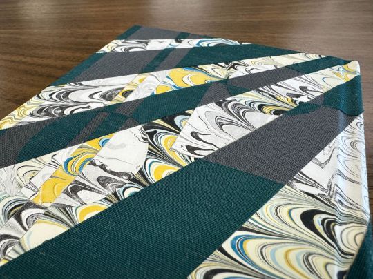
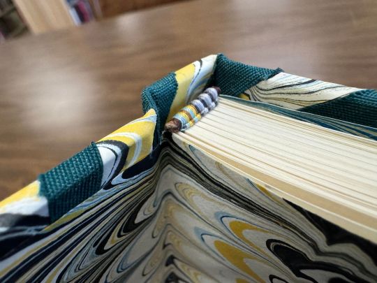
The colored marbled paper is mine own creation, marbled in my kitchen. I created the black and white version of it simply by scanning the image and printing it on a black and white laser printer lol. It gave me the truest transition into the desaturated colors of the marbled paper, and I used both as references in the endband, where the colored pattern of the threads transitions into it's base tonal iterations.
The body font is typeset in Sina Nova font. Decorative title font is Roti. Images were sourced from the Disco Elysium wiki. Everything was arranged and designed in Word.
Little video displaying the bind and the typeset.
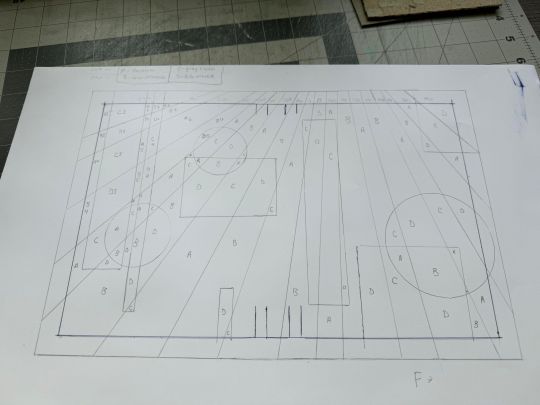
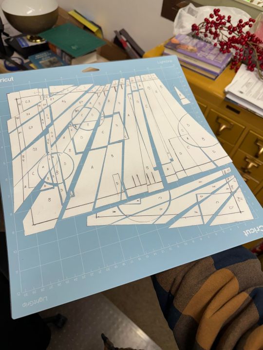
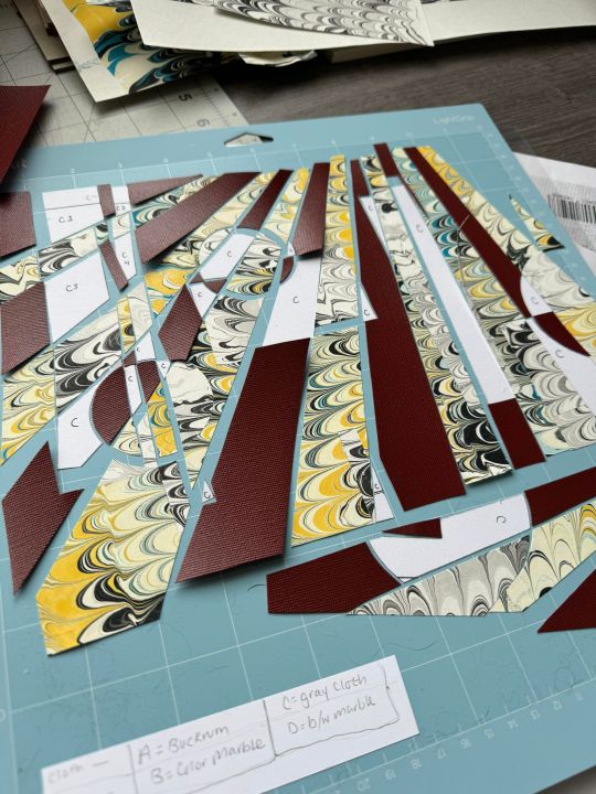
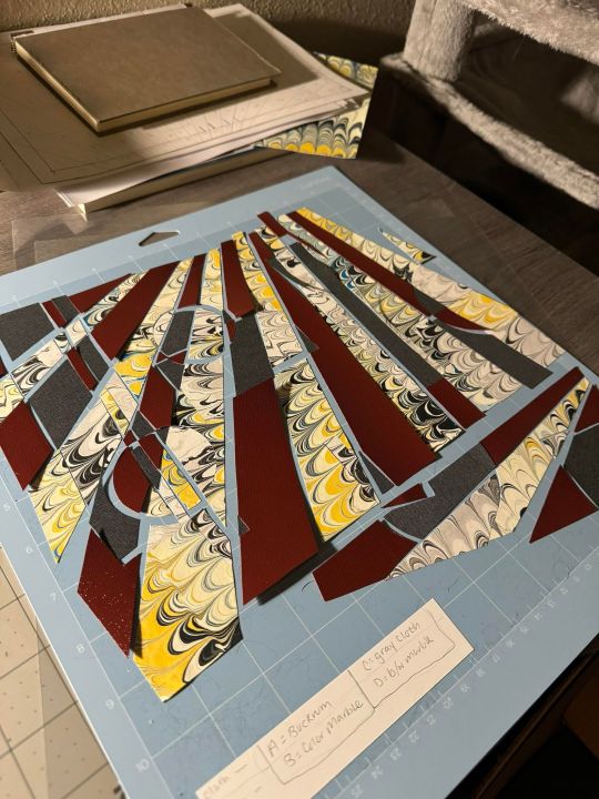
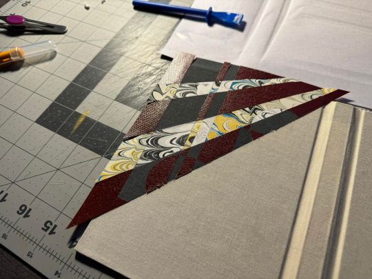
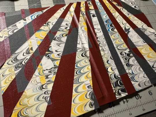
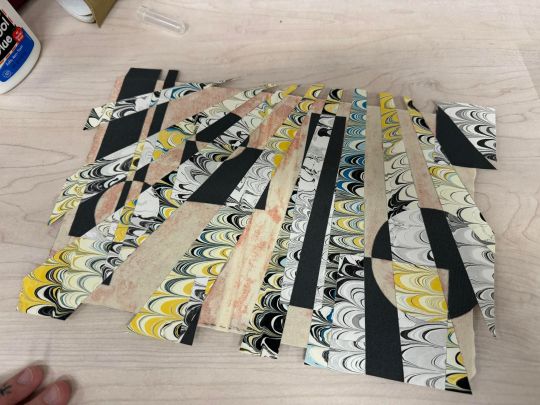
The order of events from laying the paint in the water for marbling the paper, to creating the template for the cover pieces, cutting each of those 91 pieces out, then cutting them out AGAIN from the cloth and the paper. Gluing it all on, to deciding I didn't like the buckram cloth I'd originally planned on, and tearing it off. Cutting out the pieces AGAIN and gluing them on AGAIN. Luckily buckram is so coated in acrylic that I was able to peel it up with next to no issues.
Overall this bind was very experimental for me, and I'm glad to have done it! Excited to move on to simpler projects though, I'm sure you understand.
#fanbinding#fanficbookbinding#bookbinding#cleaning out the rooms#bitochondria#disco elysium#harry/kim#no name publishing
130 notes
·
View notes
Text
Ostrichmonkey Hack: Layout Behind the Scenes
Been procrastinating on this enough! So here is a look at some of the process and decisions that went into doing the layout for the Ostrichmonkey Hack.
Let's start with the goals I had in mind:
Keep it simple.
Keep it easy to make.
With those goals set, next step is gathering materials and resources (not all of this was done as cleanly as I'm making it out to be, but this is the gist).
Materials used:
Classic Explorer Template
Affinity Publisher and Photo
Fonts
Art
The text itself
The Classic Explorer Template was critical in getting this layout done efficiently, since it does a lot of the work for you. It's not a replacement for having a rough idea on how to do layout, but it can serve as a nice tutorial/explainer on different elements of layout and typesetting, and honestly, is worth its (digital) weight in gold. There's a free version available if you want to check out what it offers.
I use the Affinity Suite for my layout work. It's a nice set of programs with a manageable learning curve, but there are plenty of other alternatives so go with whatever works for you (one of my favorite elements of using multiple Affinity programs is that within Publisher, you can access both Designer (vector illustration) and Photo (photo editing, illustration etc) functions, which is just a nice workflow).
Here's what my setup looks like, with all the guidelines/base grid stuff turned on;

Normally I start with some style tests and “sketches” to get a feel for what I want the layout to look like, but the Classic Explorer’s does a lot of that heavy lifting for me already so I get to skip this step for this project. Speed and efficiency is one of the main reasons I wanted to use the template - this was envisioned as a “I just need to get something done” kind of project.
So next up on getting it done, fonts!
There are lots of great places to get fonts from, just make sure you're getting them from legitimate sources. Do your homework and make sure that "free" font is actually free to use in commercial projects.
I pulled three fonts from the depths of my collection.
One for the title and main headers (Wallau Deutsch)
One for the second header (Rakkas)
One for the body text (PT Serif)
Technically a secret fourth font for some "bullet points" (1651 Alchemy)

I picked these fonts out because they work together well and are readable. The title/main header fonts are comparatively less readable, but you can get away with that since headers are Big and used less frequently. The second header (Rakkas) is a nice middle ground between a full on blackletter font like the main header, and the classic-y serif of the body text. It creates a transition between the two fonts.
I used PT Serif since it was already in the template, but it also had the bold/italics versions I knew I would need, is readable at a variety of sizes, and had all the special glyphs I would need (it actually did not, but whoops, we'll get to that later).
Normally when I start layout, I do a quick "sketch page" where I try out different fonts and style tests that can look something like this;

But that wasn't necessary for this project (another advantage of the using the template).
Now, let's get to some choices in formatting the text itself.

Each time a key term came up, it was highlighted by bolding and italicizing it. Any time after that, it was just normal text. I went back and forth on highlighting it every single time, but the current format just looked cleaner so it won out.
Additionally, in several places in the text, rather than introducing a third header (which just broke up the page too much, disrupting the flow and clean look), I instead put what would have been the new third header (HP or WOUNDS in the above example) in all caps and behind a colon. This ended up not disrupting the text too much, and was only necessary a handful of times. But when it was necessary, I made sure to stay consistent. Consistent and organized formatting is one of the key ways to make your layout look nice and clean.
Aside from changing some font choices, one of the other ways I tweaked the template was with some spacing (between "sections", like in the above text, introducing an extra line break between the Attributes and Staying Alive sections) and the "bullet points".
The large bullet points that accompany the second headers are actually a glyph pulled from a different font. I picked that one out specifically because its just a little irregular and handwritten looking (1651 Alchemy is a handwritten styled font), and it also helped pull you to the start of new sections, further enhancing the second header. It helps make each section discrete and more "modular".
Back to extra spacing for a second now. So each "chapter" of the text uses the main header to designate it as a full "chapter".

"Characters" up top there is one of those chapter headers. It's nice and big and special, and also takes up a good chunk of space. One a full spread, this also means that the second page of text begins higher up than the text on the first page (compare where Attributes starts vs where Dying starts).
I played around with the format of spreads that did not have a main chapter header on them, starting the first page text up toward the top to have it line up with the second page. Which, probably would have been totally fine, but I preferred the look when each spread had the same kind of spacing. But repeating the main header on each spread was too clunky. So the solution;

Bam! A line!
Blank empty space looked too empty, but slapping a quick line there took up just enough visual space for it to work. Then, I carried that line-design-language to other places (to separate footnotes from the body text, within the tables, and sort of on the cover). This then made the line choice feel even more cohesive and purposeful.
And speaking of footnotes, that was another extra tweak/flourish I added not present in the template (the sidebars are part of the template, but sidebars rule so they would have happened regardless). The footnotes served as a way to share specific references as an informal "works cited". A lot of NSR/OSR design is super iterative, so I thought it would be cool to shout out some of the more direct inspirations and references I used when making my game.
But the footnotes were also kind of not really my downfall. Turns out PT Serif didn't seem to have all the necessary footnote glyphs, nor did it want to make proper superscripts of integers past 3. So, rather than trying to find a new body font (or deal with the headache of using a font solely for superscript notation), I just fudged the formatting some and stuck to asterisks, and restarting "numbering" on each spread. Oh well.
Let's now briefly touch on laying out tables.
It sucks.
My advice is find an example of a really nice looking table and then try and figure out what makes it look nice, and then doing that forever. Luckily, the template saves me again by including multiple examples of tables, ripe for tweaking. Which ended up looking like this;

Nice and clean! Hooray!
Okay, there's a lot of small decisions that goes into making text properly formatted and look nice, but I skipped some of those decisions and didn't go ham on typesetting, but whatever. That all about covers the important parts regarding the text. Now let's talk about art.
Public domain art is your best friend.
I went and trawled through a bunch of art I've saved from the Met's Open Access collection (there's plenty of great open access collections out there, just happened to have some from the Met handy), and settled on this piece;
Which I then dropped into Affinity Photo and played around until I ended up with this;
Nothing too wild, but it Felt Right, so it's done.
I then immediately dropped that onto the cover page, slapped the title on, added a quick border (and also spent some time trying to fix some weird issues that ended up being solved by just rasterizing it, whoops) and bam;

And that's the only art piece used throughout the zine! But I made the most out of it. Between each chapter, I had a single splash page and dropped in different zoomed/cropped versions of the art. Like so (and even on the back cover!);


The original image was high resolution, so zooming in worked, plus the effects/distortions I created hid any imperfections.
So that's the art sorted and the zine finished!
Now, this is getting pretty long, so if there's anything anyone reading this is interested that I didn't touch on, shout in the notes!
38 notes
·
View notes
Text
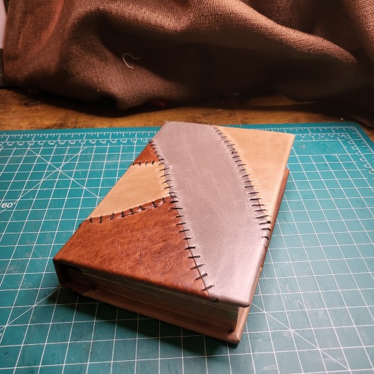
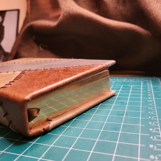
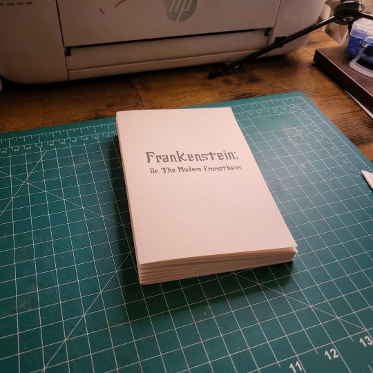
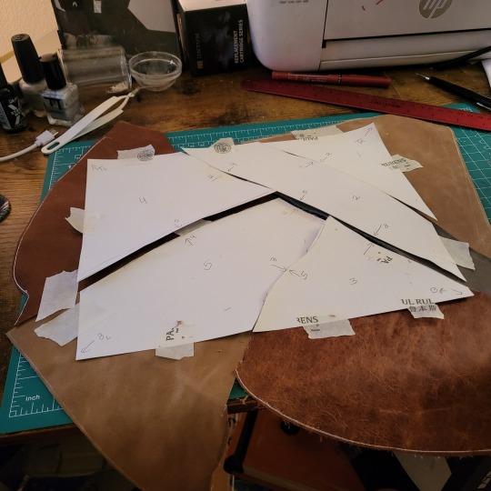
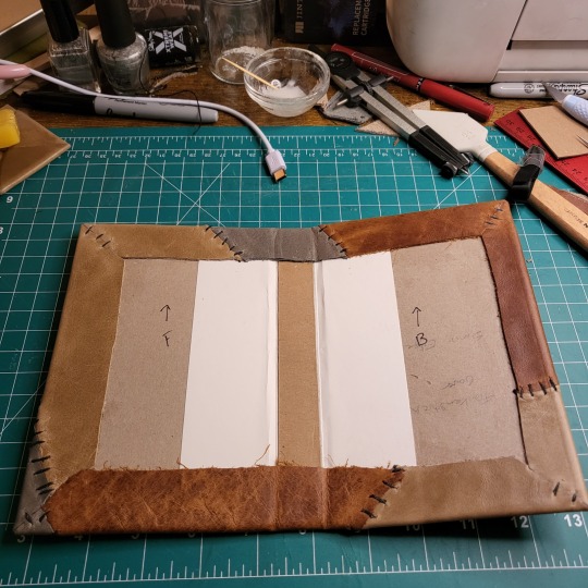
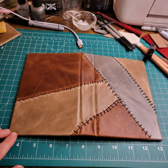
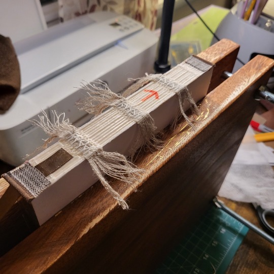
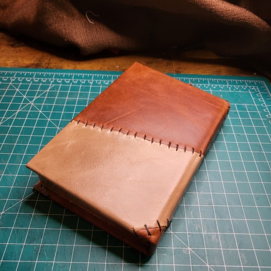
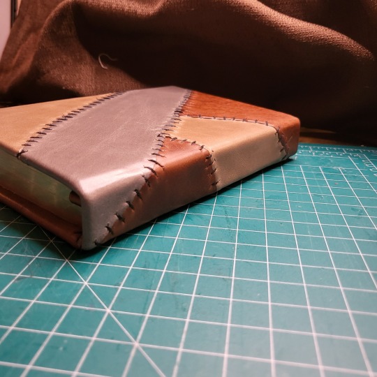
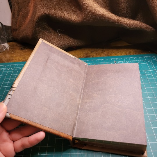
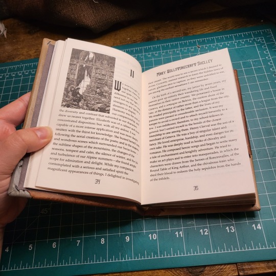
I finished my first leather-bound book! My brother envisioned having a copy of Frankenstein that is stitched leather so that it looks like skin, so for his Christmas present this year I tried to make it happen.
This was my first time working with real leather, and I am really proud of how it came out.
I also created my own typeset for Frankenstien, the text courtesy of Project Gutenberg. I used the illustrations by Bernie Wrightson throughout the text.
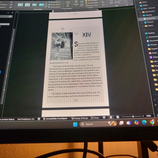
I wanted to put gilded edges on it but have only ever gilded rebinds so the edges were already trimmed. Since I don't have a guillotine capable of trimming whole text blocks I had to figure out a different way. I used a wood planer to trim, and it worked pretty well! I didn't go quite deep enough on the long edge and messed up trimming the top of one of my signatures so the top is a little uneven too, but overall it worked really well!
All the leather I used for the cover came from a scrap bag I bought from a leather vendor at the last ren faire I went to. There were a lot of really nice colors and pieces. I pieced them together and made templates to ensure I cut out the right pieces. I researched a couple different stitches and decided that the back side of a cross stitch looked the best and resembled what looked the most like Frankensteinesc sutures.
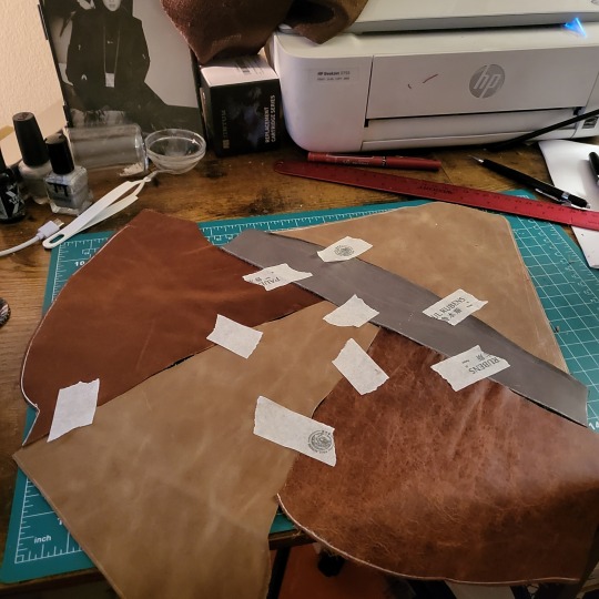
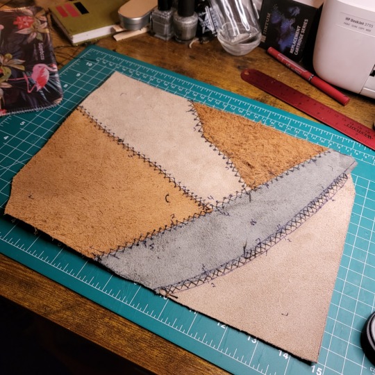
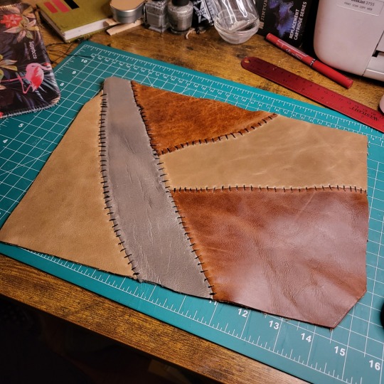
Once everything was stitched together I glued it onto the boards. The corners were probably the hardest part since leather corners are done differently than book cloth. They aren't perfect but I think I did pretty good for a first try!
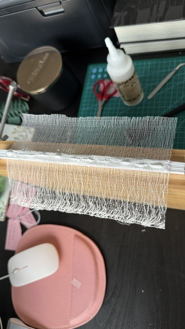
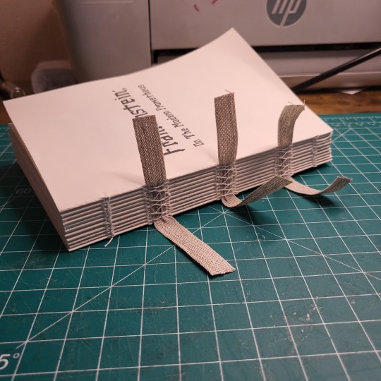
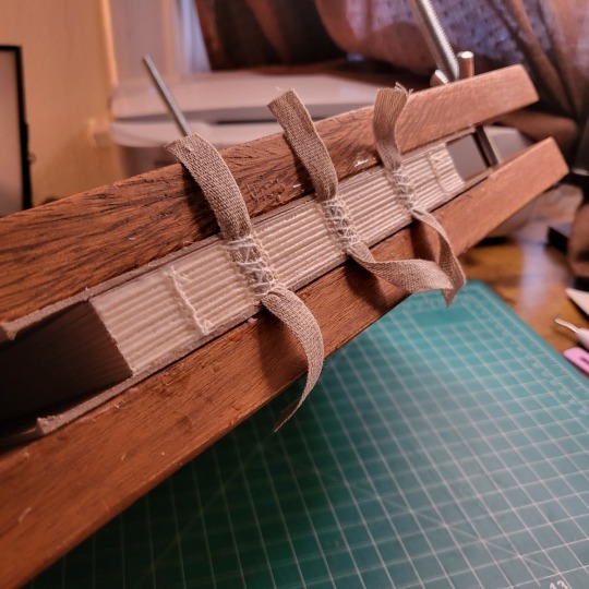
I finished up the text block once all the colors of the cover were decided on. I wanted to make sure the colors I chose for the headband and the ribbon matched. I tried fraying my linen tapes so that they are less visible under the end pages. This is the first bind I've done this on and I'm definitely gonna keep doing it.
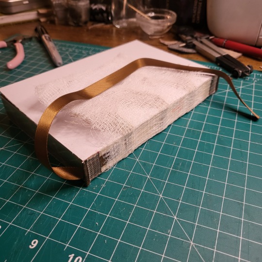
I cased it in, and am eally happy with the final results! I should have made the spine a little wider to compensate for how thick the leather is but I'm hoping that with time the leather will loosen up a bit so there is less tension on the hinges.
24 notes
·
View notes
Note
Hey I just gotta say your bind of OTNWAS is GORGEOUS! Do you mind explaining how you formatted the pages? <3
hello, thank u sm <3!! and yes ofc i can :)
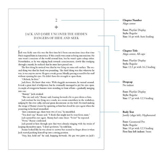
i used Adobe InDesign to do all my typesetting! the document i have has a total of 948 pages (475 spreads) which all include: title page, contents page, chapters, and a few customized + blank pages.
starting with document size first — mine is in A5 (so that i can print A4 spreads) you can play around with the margins, i recommend having at least 3mm added on to it if you’re going to trim it (the bleedline basically). my margins are 15mm left, 20mm right, 15mm top, 20mm bottom.
i had 2 chapter templates - one for short titles (i.e. jack flies) and one for long titles (i.e. jack and jamie uncover the hidden dangers of hide and seek). if you look at the pictures i posted, i added a snowflake as part of that template as an indicator of whose pov the chapter starts in. i designed one for hiccup and jamie too so i change it accordingly! i also use it as dinkuses whenever there’s a pov change within the chapter.
my body text size was 10pt with a 12.5 leading (justified + hyphenated) but honestly that also depends on the font you choose and your personal preference in terms of how spaced out you want your body text to be. i suggest doing test prints so you can adjust !! standard book fonts are: caslon, garamond, minion and palatino.
here’s a silly diagram i made for my friends of my exact settings 📖
in terms of actually formatting the fic— i copy-pasted chapter by chapter from ao3 because for some reason InDesign doesn’t recognize italics automatically so i had to do that manually LOL.
what else .. uhhhh i’m pretty sure i’m forgetting something… i’ll just add on when i remember but crossing my fingers this helps!! i know InDesign isn’t what’s the most accessible to people (i have it bc of my job), but there are lots of tutorials out there on how to do it on microsoft word or even google docs!
hope your binding goes well ⭐️
#local-dragon-haunt#jackshiccup ask#otnwas#IF U NEED ANYTHING CLARIFIED LMK#im pretty bad at explaining#ndbdjsbdd#also if anyone would like to copy my format/typesetting design you can go ahead!#a credit would be nice tho maybe dkdnnddbnxbx#but please design your own book covers !!!#that’s like the most fun part tbh#go crazy go stuuuuupid
42 notes
·
View notes
Text
FTH 2024 - By the Numbers
With just a few days to go (signups close on MONDAY!), we have an incredible 524 creators signed up to offer 720 auctions in 260 fandoms! We're counting 107 listed and 153 unlisted fandoms, plus 90 folks offering to work in ANY fandom.
The breakdown of offers by type looks like this:
473 Written fanwork (fic, fan poetry, etc)
102 Fan art
80 Fan labor (beta services, translation, Brit-picking, typesetting, etc)
43 Podfic
14 Other Digital Fanwork
7 Video
When it comes to choosing orgs, creators are overwhelmingly leaving the choice up to their bidders. For those that have selected specific orgs, the numbers look like this:
173 Middle East Children's Alliance
119 Sherlock's Homes Foundation
102 Never Again Action
99 In Our Own Voice
89 National Network to End Domestic Violence
87 Any/All Environmental
76 Civil Rights Education and Enforcement Center
74 Life After Hate
61 Violence Policy Center
56 Razom
55 Spread the Vote
44 VoteRiders
43 Coral Restoration Foundation
37 Pollinator Partnership
35 Bellingcat
20 Wildlands Restoration Volunteers
14 Deploy/Us
10 Together Bay Area
And the most unique category, 'other digital fanwork', currently includes offers of:
Discord server creation & starter management
Playlist
Icons
Digitally produced orchestral music min 5 minutes long
Webpage template
Moodboards
Calligraphy
Animation
Conlang basics
Complete song based on supplied lyrics
Stay tuned for updates on both listed and unlisted fandoms later today!
Signups are OPEN!
57 notes
·
View notes